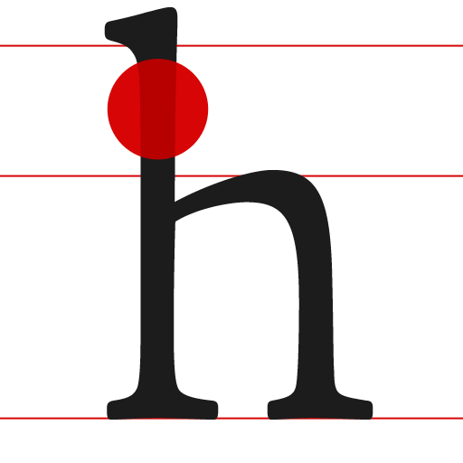
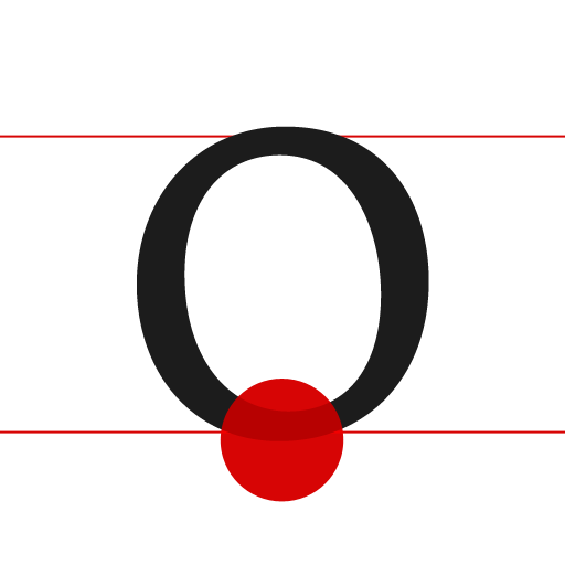
• typecards

  • Instructions

    typecards is a digital typographic reference that goes with you on all your devices. Use the flash cards to build your typographic knowledge or search for terms and keywords to discover oddities like what that little hook on a ‘g’ is really called.

    Pull down the cards to get started or enter a search term to jump to a specific card. After that you can swipe to navigate through the cards and tap a card to flip it and view its details.

    About

    typecards is an experiment by @jimmynotjim using html and javascript to create a native app like experience, on any device. It's a work in progress so there's sure to be bugs and incomplete information. Please report any inconcistencies to help@typecardsapp.com.

    Online

    Web
    typecardsapp.com
    Twitter
    @typecards
    appnet
    @typecards
    Web
    jimmynotjim.com
    Twitter
    @jimmynotjim
    appnet
    @jimmynotjim
  • Aperture

    Definition

    The open space in the partially enclosed, somewhat rounded negative space of a letter form or symbol (or open counter).

    Some type families have very narrow apertures, while others are much wider. At small sizes or at low resolution the apertures of some letters may fill in and appear solid, decreasing readability (like with Helvetica).

    Also Known As

    open counter

    Examples

    Characters containing an aperture include c, e, g, h, m, n, s, u, C, G, S, and U

  • Apex

    Definition

    The point at the top of a character—such as an uppercase A–where the vertical strokes meet. The apex may be a sharp point, blunt, hallow, extended or rounded. The apex will typically extend past the cap-line, especially with families that are pointed (like with Futura) or hallow.

    Also Known As

    top

    Examples

    The tops of the letters A, M, N, and W

  • Arm

    Definition

    The arm of a letter is the horizontal stroke that does not connect to a vertical stroke or stem at one or both ends. The top of the capital T and the horizontal strokes of the F and E are examples of arms. Additionally, the diagonal upward stroke on a K is its arm. Sometimes arm is used interchangeably with bar, crossbar, or cross stroke.

    Arm is also often used to describe the mostly horizontal top stroke of C, double-storey a, G, and other glyphs, to include the finial, terminal, spur, or other elements of the stroke.

    Also Known As

    crossbar, cross stroke

    Examples

    The arms of an uppercase F connect to the stem only at one end and the arm of an uppercase T sits at the top of the stem and doesn't connect at either end. In contrast a cross stroke intersects the stem of a lowercase t or f and the cross bar connects the diagonal strokes of an uppercase A or the vertical stems of an H.

  • Ascender

    Definition

    The upward vertical stroke on some lowercase letters, such as h and b, that extends above the x-height and often above the cap height. Families with shorter x-heights typically have longer ascenders and vice-versa.

    Also Known As

    extender

    Examples

    The stem of the letters b, d, h, k, and l that extends above the x-height.

  • Axis

    Definition

    An imaginary line drawn from top to bottom of a glyph (letter or character of type) bisecting the upper and lower strokes that indicates the angle of stress. The inclination of the axis of the lowercase o is used to measure the angle of stress. A completely vertical axis indicates an angle of 0 or vertical stress, while an axis that leans to the left or right has angled (positive or negative) stress. Early styles of typography usually shared the same axis or stress angles.

    Also Known As

    stress, angle of stress

    Examples

    Old Style fonts, based on ancient Roman inscriptions, typically have a left-leaning or negative axis while Transitional styles that evolved later had less stress or a closer to vertical axis.

  • Baseline

    Definition

    The imaginary line where a line of text appears to rest and below which descenders extend. The baseline combined with the height of the lowercase x define the x-height. The vertical distance between two baselines makes up the line height or leading. This vertical distance is used to create a vertical rhythm or vertical grid of a page.

    Examples

    Letters such as i, m, n, w, x and z sit on the baseline while letters such as a, c, e, o, s, and u have an overshoot and sit just below the baseline.

  • Bowl

    Definition

    The curved part of the character that encloses the circular or curved parts of some letters, such as d, b, o, D, and B. Some also consider the straight side of a closed counter to be a bowl. This includes both sides of an a, both parts of a double-storey g and the straight stem on a D or B. The curved strokes of a C are also sometimes referred to as bowls although they aren’t closed.

    Examples

    The bowl usually refers to the main, enclosed circular portion of some characters and not usually the curved loops that may be a part of the extenders or other flourishes on letters such as the double-storey g, cursive b, d, l or y.

  • Bracket

    Definition

    The transitional element of a character that connects a stem with a serif. Often this takes the form of a curve, but could also be a sharp angle. In cases where there is no transition from the stem to the serif—such as in many Didones—the character has no bracket.

    Also Known As

    bracketed serif, fillet

  • Cap Line

    Definition

    The height from the baseline to the top of the uppercase letters excluding the overshoot. The cap height is not always the same as the ascending line of a fonts ascending letters.

    Examples

    The flat top of a capital H, T or W will define the Cap Line.

  • Counter

    Definition

    The enclosed or partially enclosed circular or curved negative space (white space) of some letters such as d, o, and s. The term counter may sometimes be used to refer only to a closed space, with open counter referring to the partially enclosed spaces in m, n, or h.

    Also Known As

    aperture, inner space, enclosed space

    Examples

    Letters containing closed counters include A, B, D, O, P, Q, R, a, b, d, e, g, o, p, and q. Letters containing open counters include c, f, h, i, s etc. The digits 0, 4, 6, 8, and 9 also possess a counter(s).

  • Crossbar

    Definition

    The (usually) horizontal stroke that connects two stems, such as in an A or H. Although often used interchangeably, the crossbar differs from an arm and a cross stroke because each end connects to a stem or stroke and doesn’t (usually) intersect/cross over the stem or stroke.

    Also Known As

    bar, arm, cross stroke

    Alternate Spelling

    cross bar (two words)

    Examples

    The cross bar connects the diagonal strokes of an uppercase A or the vertical stems of an H. In contrast, the cross stroke intersects the stem of a lowercase t or f while the arms of an uppercase F connect to the stem only at one end.

  • Crotch

    Definition

    An acute, interior angle where two angled strokes meet, similar to the junction of two limbs of a tree.

    Examples

    The interior angle of the letter V is it's crotch.

  • Descender

    Definition

    The portion of some letters, such as g, y and Q, that extends or descends below the baseline is the descender. Some typefaces, also use descenders on old-style numerials (typically 3, 4, 5, 7, and 9).

    Also Known As

    extender, tail, loop

    Examples

    The descender may be a stem (p, q without a loop), a stroke (y without a loop), a loop (double-storey g), or a tail (Q, regular g).

  • Diacritic

    Definition

    An accent mark that aids in pronunciation. In many non-English Latin languages, it is used to differentiate homonyms. For example, the acute diacritical over the letter e changes the pronunciation to more of a long a as in resumé and café. The most common diacriticals are acute, cedilla, circumflex, grave, tilde, and umlaut.

    Also Known As

    accents, accent marks

    Examples

    The list of possible diacritics is extensive and varies greatly depending on the language of the text, though â (circumflex), é (acute), ç (cedilla), ü (umlaut), ñ (tilde) are some common examples of the use of diacritics.

  • Diagonal Stroke

    Definition

    An angled stroke that often connects to a stem.

    Examples

    The angled lines of an A, M, N, V, and Z are all diagonal strokes.

  • Discretionary Ligature

    Definition

    Certain typefaces have a ligature that is somewhat more unusual, and it is left up to the designer to chose to use these ligatures. They are rarely used in body copy, but often used in display type or logotypes to create an additional typographic flourish.

  • Ear

    Definition

    The decorative flourish found on the lower case ‘g’, projecting from the upper right side of the bowl.

  • Extender

    Definition

    A somewhat generic term that can refer to either an ascender or a descender.

    Examples

    These characters all have ascenders or decenders, and are thus considered to have extenders: b, d, g, k, p, q

  • Eye

    Definition

    Similar to a counter, specifically the enclosed space in a lowercase e.

    Also Known As

    counter

  • Finial

    Definition

    The end of a letterform that is a tapered or curved.

    Also Known As

    terminal

    Examples

    The lower terminal on the letters c and e as well as the upper terminal of a double-story a are finials.

  • Hairline

    Definition

    The thinnest stroke found in a typeface that consists of strokes of varying widths.

    Also Known As

    hair stroke

    Examples

    The hairline is most obvious is high contrast faces such as modern Diodones.

  • Leg

    Definition

    The lower, angled stroke of the K, k or R excluding the serif.

    Also Known As

    Tail

  • Ligature

    Definition

    An optional connection between two or more characters to create a more visually appealing arrangement of the characters. The designer may opt to use ligatures in situations when characters repeat (such as “ff”) to create a more dynamic shape or when the dot of a character might intersect with another character (such as “fi”). Some modern fonts expand the concept by offering extensive swashes or alternate characters that are created through the use of ligatures.

    Examples

    ff, fi, ffi, ft, st

  • Open Counter

    Definition

    The partially enclosed circular or curved negative space (white space) of a letter as in c, e, m, n, or h.

    Also Known As

    aperture

  • Overshoot

    Definition

    If the lowercase “o” where the same height as an “x,” it would appear shorter to the eye. To maintain a visually consistent size, type designers extend the tops and bottoms of certain characters beyond both the baseline and x-height for lowercase letters, or beyond the baseline and cap height for uppercase letters.

    Examples

    Though it varies by typeface, these characters often utilize overshoot: a, c, m, o, s, A, C, O, Q, S

  • Shoulder

    Definition

    The curve reaching out from the leg of a character, such as in an m or n.

    Also Known As

    arch

  • Spine

    Definition

    The main left to right curving stroke in an upper and lower case S. The spine may be almost vertical or mostly horizontal, depending on the typeface.

  • Spur

    Definition

    Similar to a serif or beak, a spur is a small projection at the end of the curved portions of letterforms, such as the end(s) of a C or S, the middle of a G or where the curved taper meets a stem as in a b, d, p or q.

    Also Known As

    serif, barb, cat's ear

  • Stem

    Definition

    The stem is the primary–and most often vertical–stroke of a letterform excluding any serifs. In most fonts the stem is roughly the same thickness as the other strokes of the form. In high contrast typefaces, the stem may be distinctively thicker or thinner than the other strokes.

    Also Known As

    stroke

    Examples

    Not all letters have a stem, such as C or S. The vertical, non-curved portions of L, l, d, B, and p are examples of stems. H, N, and M have two stems each. Some letterforms such as y and A may have a sloped or diagonal stem.

  • Tittle

    Definition

    A small mark or dot above a lowercase i or j.

    Also Known As

    dot

  • X-Height

    Definition

    An relative measurement that is the vertical distance from the baseline to the top of the lowercase “x” character in a typeface. Other lowercase characters are often a similar height to the x—such as the v, w and z—but the x is used as the top of the character is usually the closest to flat and level on many typefaces. Faces with a larger x-height are often more readable, but will likely take up more space.

    Also Known As

    meanline

Prev Next